Cyber Triage 2.0 has been released with a new user interface and can be used for free (with a reduced feature set). The new UI allows you to make better decisions, and prevents missing evidence by automating the incident response triage workflow and giving more context about events. The free version allows companies to collect and view data from live systems, but does not include automated analytics.
This post covers how the new user interface makes it even easier for companies to perform a mini-forensic investigation of endpoints without needing agents to be deployed. We’ll cover the details of the free version in a future post.
New User Interface
As our users know, we are eager to listen to your requests, and add requested features as quickly as we can. This means that we periodically need to rethink the user interface to make it easier to find and use all that Cyber Triage has to offer. For the 2.0 release, we decided it was time for a new look.
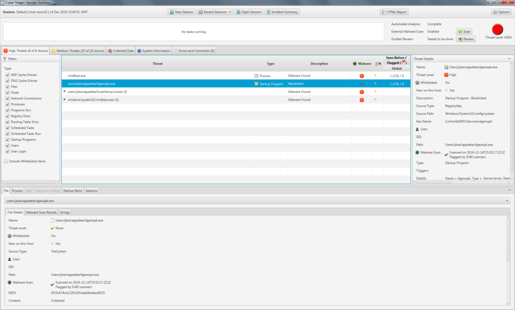
The previous 1.7 release:

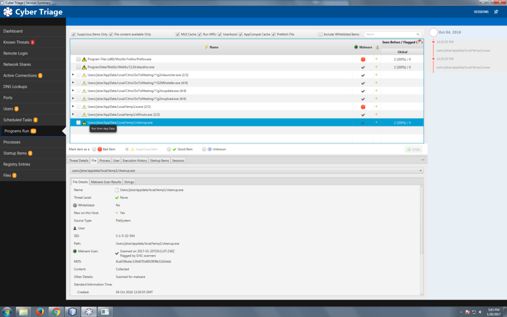
And the new release:

You’ll notice the following key differences:
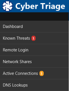
- All data types that we collect are now shown on the left-hand navigation and you can jump between the data types to focus on what is relevant for your investigation. In 1.7, all of this data was available, but it was scattered in different places.
- Some of the data types are more fine grained to make it easier for you to focus on common sources of evidence. For example, there are now separate tables for remote logins, network shares, and DNS cache items because each is important for different reasons and involve different data. In 1.7, they were all in the same “Remote Hosts” table and you had to use filtering to focus on the different data types.
- An entirely new timeline feature shows dates associated with bad events and can be used as a quick reference when looking at other suspicious items. For example, imagine one of the malware scanners marked a startup program as bad but 15 others didn’t. You aren’t sure if it is a false positive or new malware that isn’t being widely detected. You can look at the 8 NTFS times on the file and compare them to the mini-timeline to see if any are close to the dates of other known bad events.
In short, the new UI makes it easier for users to quickly find the most relevant data and make informed decisions.
More Automated Workflow
Not only does the new UI make it easier to find data, it also makes it easier for the user to understand the Cyber Triage workflow. Automating the workflow reduces training and errors. The workflow is as follows:
- Cyber Triage begins automated analysis in the background as data is collected and the various techniques will classify the item as:
- Bad: The item matches evidence from a previous incident or an analysis technique with low false positive rates flags the item.
- Suspicious: The item is similar to evidence from previous incidents.
- Good: The item was found in the NIST NSRL or a user-created whitelist.
- Unknown: None of the above are true.
- You review the items marked as “Bad” to verify they are not false positives. You can find them in the “Bad Items” left-hand menu item.
- You use the menus to locate the suspicious items

- For each item, you can mark it as Good or Bad based on what you know about the system and its users.

- After reviewing the suspicious items, you can then review the other “unknown” items if you are still looking for evidence. This step depends on how deep your investigation is and what evidence you have already found.
- You can generate a final HTML report that outlines the findings along with CybOX objects.
As you use Cyber Triage and mark the Suspicious items as Good or Bad, then the backend database records this and will help to make future decisions easier.
Try It Yourself
The new Cyber Triage interface makes it easier to find evidence and train your security team to use. It automates the workflow so that you don’t miss steps and gives you more context so that you can make better decisions.
If you want to try to Cyber Triage 2.0, fill out our form and we’ll send you an evaluation copy.